Google+ is continuing to grow in popularity and companies should take note. This growing social network is becoming closely tied to how Google finds and displays search engines results, so it should be a key part in a company’s SEO and social media strategy. The new Google+ Layout was introduced this week and includes a new layout and a bigger emphasis on photos. These are some of the big changes that most people noticed about the new layout. Making sure that you and your company are using these new features correctly will make a better impression on other Google+ users and can help make your page and profiles more successful.
More Whitespace
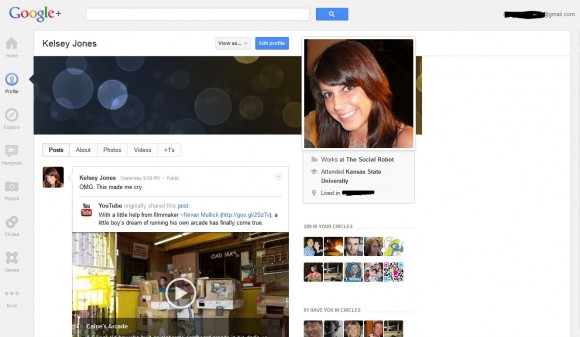
This is probably the most noticeable change. Most of the information is shifted onto the left side. Users are already lamenting the whitespace on larger monitors; luckily Lifehacker has already shared a Chrome and Firefox extension that helps remove the whitespace on your own browser, making the information the main focal point (note: this will only work on your own browser. Another user who doesn’t have the extension installed will still see the default whitespace). However, the whitespace also gives Google+ a cleaner look. To compliment this uncluttered look, choose a simple profile photo and cover image.
More Emphasis on Photos
The cleaner look includes a great emphasis on photos and images, including a bigger profile photo to the right hand side of the profile information and a cover image, much like the cover image that is on the new Facebook Timeline layout, which was made mandatory by Facebook for all pages on March 30, 2012.Make sure the cover image and the profile picture are not blurry or distorted and offer a good initial impression. Additionally, add photo albums of company events, products, and employees to make the page more personable.
Redesigned Navigation
The navigation menu is now along the left hand side of the page, instead of at the top. It includes seven main headings:
- Home
- Profile
- Pages
- Explore
- Photos
- Circles
- More
These menu items are pretty self-explanatory; hovering over the menu item on some will cause an option menu to appear (For instance, hovering over the “Pages” item will cause of a list of all pages the profile you are logged in as has administrative control over).
Trending and Suggestions
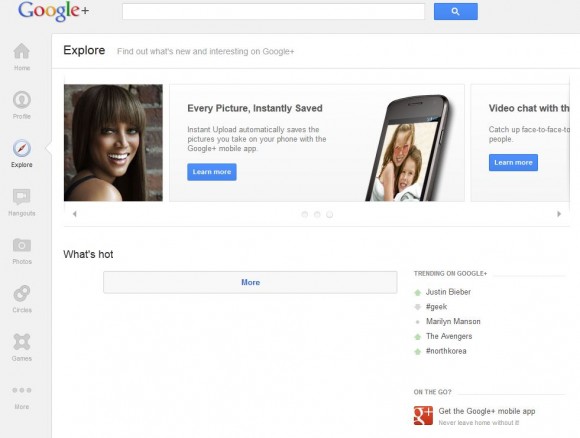
The ‘Explore’ menu item will take the user to a trending and suggestions panel, which lists “What’s hot” on your Google+ network; what is currently trending on Google+, and other things that a user can do on Google+, including video chats with up to 9 users at once and who to follow on the growing social networking site.
These are the main changes that happened on Google+ this week. Google representatives are also working on improving online chat and video quality, which is all tied into a user’s GChat contacts. As Google+ continues to grow, expend the search engine giant to continue to change and shape this networking site to make it more of a substantial force in social media.


