Converting your website visitors is one of the most important steps in turning them from someone who is just browsing your site into a lead and then to a customer and finally into a returning customer. Just getting your site up and running with content on it and ranking in the SERPs does not guarantee that people coming to your pages are going to hand over those crucial and sort after contact details.
What exactly is a conversion?
A conversion is when a visitor on your website responds to a call to action or ‘CTA’ requested by the website, this CTA could be something simple as asking for a name and email or it may be for getting a visitor to sign-up on the site as a user or even make a purchase. The conversion happens once the visitor has made all the required steps and a conversion rate is the % of visitors to a page or website that completed this CTA. Conversion rates are often very, very low though and the more that is required from a visitor (eg a simple contact details vs a payment) the lower conversion rate.
Here are a few tips you should implement on any page of your site with a CTA to boost those conversion rates.
Keep the page clutter free – If your sidebar is stacked full of flashing ads and links or any other kind of distraction then this is going to pull the user away from the page they are on. Remember the goal here is to have them stay on the page and complete the CTA and not leave until they have done that. If you must have other banners, buttons and links on the page then try to use as much white space around them as possible so that your CTA doesn’t get drowned out.
If you want to see an excellent an example of a clutter-free page with a beautiful form and call-to-action then check out Brain Gardner’s site NoSidebar.com, which as you can see, has no sidebar 🙂

Long, compelling copy is the way – Once you have the user on the page you need to keep them curious and not looking to leave the page, captivating titles but also anecdotes and stories are an excellent way of keeping a visitor reading until the end and if they have been happy with what they have read then they are more likely to convert also.
Multiple calls to action – If you are using longer copy then you may want to have CTAs placed at the start, middle and end of the content, this way users are reminded to submit their details, download a file or make a purchase without forgetting and closing the page.
Break -away from the mundane – How many times have you seen the usual run-of-the-mill choices in a call-to-action sign-up form on a website? They usually go something like this; ‘Do you want to more of XYZ?’ and then you are presented with the enthralling options of ‘Yes, I do’ or ‘No, thanks’. Too many websites are using this in their sign-up forms and it just sends people to sleep. If a user is presented with a form, especially a pop-up one then you have only split seconds for them to either take the dive and hand over their contact details to you or click the close button and move on. Make that split second count by doing something a bit different, take a look at the copy Derek Halpern of SocialTriggers uses for example in the yes/no buttons here:

Be more personal – Instead of using the normal ‘us to everyone’ business style, try to be more personal with a ‘me to you’ approach instead.
Offer different bonuses – If you are giving something away for free to entice the visitor into converting then try experimenting with something else. For example, lets say you have been offering a free ebook to everyone that signs up at your site then maybe offer a 10% discount voucher to everyone that signs up that weekend instead? If they are making a purchase then try offering free shipping too?
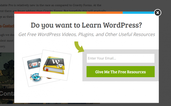
Ask questions – Asking a question to the user can be a great way to pique their interest, especially if you know that the people visiting that particular page have a problem they need solving. See how WPBeginner.com have implemented this with a simple pop-up form on their site.
Get creative with your forms – Making sure you have a form that visually ‘pops out’ from the page but doesn’t clash with the rest of the site. If your website is using WordPress then there are numerous form builder plugins such as CaptainForm which come with a wide selection of themes and styling options.
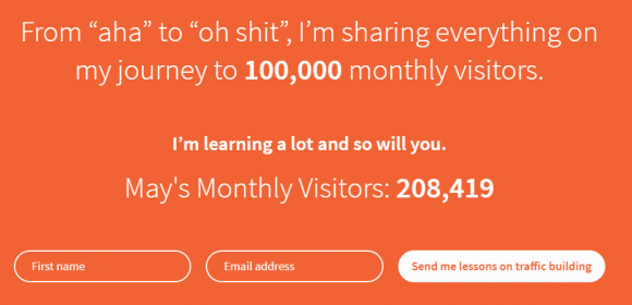
If you have impressive data or metrics then show them off! – People are more likely to be interested in what you are offering if they can that it is already popular, so if you have a significant number of visitors to your site, downloads or number of purchases then make sure you are shouting that from the rooftops! See how Neil Patel is implementing this on NeilPatel.com to show how many people have visited his site that month.
A/B test, and keep testing – Finally, you should always be testing. Even if something is working and you are getting conversions nothing ever stays the same and you should always be looking to squeeze out an extra few percentage points of conversions. So every few months take a step back and analyse what has worked and look at what changes and improvements can be made. No webpage or website in the world is ever perfect!
Are there any conversion tips you’d like to add? Let us know in the comments 🙂
5 thoughts on “Stop Letting Visitors Slip Through Your Fingers By Implementing These Conversion Tips”
Thanks for sharing, David. I will try them out
Great Tips David , thanks for sharing !
I have tried to do so but hardly but it is very hard to engage visitors
Nice Post, Thanks for Sharing This post.
Comments are closed.