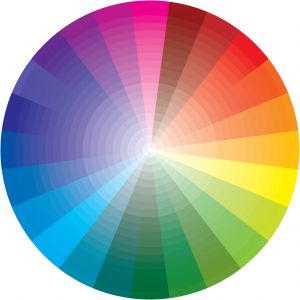
 I’m a marketer by profession, and one of the areas of marketing that I find very interesting is color marketing, which focuses on how color affects consumer brand perceptions and purchase behavior.
Did you know that you can apply color marketing theory to your blog’s design? It’s true. Your blog is a product, and you should market it as such even in its design.
Following are some statistics culled from marketing research over the years that shows how color can affect consumers, just as color can affect your blog’s audience and their willingness to keep reading your blog after they find it. If you have any doubt that color can affect your blog’s success, keep reading!
Color increases brand recognition by up to 80%. That means color could have a significant affect on how well visitors to your blog remember and recognize your blog on future visits. Recognition is the first step to building a brand, so it should be an important part of your blog’ design, too.
Ads in color are read up to 42% more often than the same ads in black and white. This statistic can apply to online content, too. In other words, if your blog is devoid of color, it could miss out on a significant amount of visits and page views.
Color can improve readership by 40%. If you want to keep visitors on your blog longer and make sure they read your blog posts from start to finish, use color strategically both in your blog’s overall design and within the formatting of your individual blog posts.
Color can improve learning from 55% to 78% and comprehension by 73%. That means if you’re trying to teach your audience something, color can help significantly. Certainly, highly technical blogs would benefits considerably from the strategic use of color.
Tests indicate that a black and white image may keep a person’s interest for less than two-thirds a second, whereas a color image may hold a person’s attention for two seconds or more. If you want to get your audience’s attention and hold it, use color images on your blog.
So what do you think? Are you using color in the most appropriate and effective ways on your blog? It can make a big difference in terms of readability, shareworthiness, and loyalty. Stay tuned to Performancing for more color marketing theory. I’ll follow up on this post next week with information about color meanings, so you can evaluate your blog to ensure you’re using the best colors to attract the right audience and meet your goals.
Image: stock.xchng

No doubt that the success of a site big impact and color combinations. A good selection of colors and attractive design can increase the success of the profits.
Thanks for the post!! I really appreciate the effort of the Author for making this article very effective .This will surely help those people who are desperate in their business.
“Color Marketing” could be an artistic way of attracting consumers to your site. & it may well depend too on color mixing when you design your web site.
There is absolutely no doubt that colors are important as they elicit a range of emotions and responses. If you do much research in it you will find more than you bargained for. This is important to remember when you are building a site, would you have a dark grey/silver site for perfume? This is a great post and the email that was sent out about colors was good as well.
Thanks
Bill
I think the color one chooses reflects one’s personality—which I know one will use as the dominant color for their blog.
Color theory is interesting. I am interested in learning about what colors make a profitable blog. I often feel that what makes a blog attractive is not what makes a blog profitable.
Craig, don’t worry. I look at gender branding from a marketing perspective and meeting customer expectations for a brand, not from an “equality” perspective. It’s all about the audience. Gender branding is a topic I love because it relates to developing brand promises and messages for disparate audiences. There are brands that are positioned primarily as being for a male audience. Others are strongly positioned as being for a female audience. There are pros and cons to both approaches. That’s why some brands are positioned as being androgynous. That’s the most interesting form of gender branding to me, but it’s also the most challenging.
Oh no don’t start on a male and female debate,
You will just open up a can of worms!. I try and add pictures to my blog post just
to make them a litte more intersting. I have never really thought of taking it to
the next level.
Determining what colours work best to attrack more visitors or make it more pleasant
for the reading is something I should consider.
Lucy, I’ll definitely write about that! In fact, you’ve touched upon one of my favorite topics — gender branding! 🙂
A post on colour meaning would be really useful. I have branded my blog using blues which are also used on my twitter page. I went for it becasue it took me to a place that felt relaxed and I wanted the sea in there somewhere. But a client of mine who promotes golf has gone for black and yellow to give the site a strong male feel. Talking about male and female colours could take us into very interesting territory!