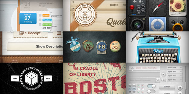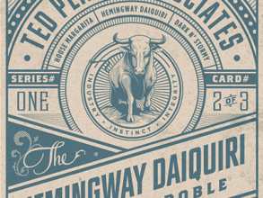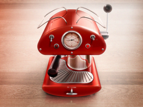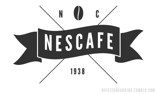
In the recent Smashing Magazine feature, Symptoms Of An Epidemic: Web Design Trends, Mr. Brunborg lists the popular design techniques and elements that has hit the community these past few years as the replacement the glossy, glassy gradients of the “Web 2.0 look”. It’s realism and skeumorphism meets textured and traditional. Get your bingo cards ready and check these bad boys off:
- Stitching
- Zigzag borders
- Forked ribbons
- Textures
- Letterpress
- 19th century illustration
- Muted tones
- Justified or centered typography
- Skeumorphic features
Taking pride in good design

I think the perspective missing in that article is that there’s a large sense of pride in creating graphical elements that imitate real life, since those things stir something in casual, non-designy people the same way they like other forms of eyecandy, or candy in general. There’s also a certain rush, a unique treat in the experience of gazing upon and using such interfaces as you are transported to a slightly different era, yet at the same time enjoy all the affordances that current technology has achieved. It’s like the appeal of Steampunk, which is an amusing marriage between the aesthetics found during the steam engine era combined with the bells and whistles of the modern world.
It may be easy to create the amateurish version of these elements these days, but the truly dedicated designer will spend hours on end perfecting every pixel. If it’s a rushed, half-assed job, it will reflect on the design, and will tell everyone you were just trying to jump on the bandwagon the same way you wanted a “Web 2.0” site, without even caring to figure out what that meant. If it’s a carefully crafted design, the quality will shine through.

I could even dare say that this trend is an on-going challenge among designers. An unspoken contest where one is able to say “I can pull that off” using these familiar objects as the common ground. Of course a more worthy challenge would be to use every form of inspiration in the universe and not be restricted to these elements, but that’s another context.
On a less cynical or narcissistic note, I like to think that designers, especially those for the web, consider themselves artisans and craftsmen that are very particular if not attached to their creations. When they use these current design trends, they tend to evoke those same qualities: authentic, vintage, nostalgic, imperfect, unrushed, simple, imperfectly polished, organic.
What does this mean for you?

What does this mean for non-designers, clients, and the like? It means this list of trends is getting to a point where you have to ask: where do you draw the line between being “hip” by adapting such an aesthetic, and being a “fashion victim” by slapping on too many of these styles at a time?
The other, more important question of course: do these design elements fit the message that your company, product, or service is trying to promote? Or are you just blindly following the bandwagon because you feel like it, or your designer feels like it?
